

Color Study: Handling Reds in Light, Shadow and Reflected Light, Featuring Artist, Abram Arkhipov
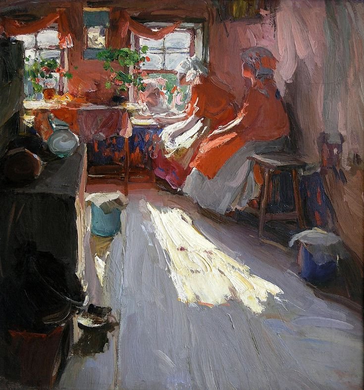
Abram Arkhipov, a Russian realist painter known for his vibrant depictions of peasant life, had a particular affinity for reds, especially in his later works, such as Visit (1915), where he masterfully handles color under varying light conditions. Below, I’ll analyze how Arkhipov approached reds in direct light, shadow, and reflected light, focusing on his painting techniques and the influence of surrounding colors, drawing on his style as described in available sources. Since reds in sunlight can be challenging due to their tendency to lose vibrancy or appear overly saturated, Arkhipov’s methods offer valuable insights.
1. Reds in Direct Light
In direct sunlight, reds can appear intensely bright but risk looking flat if not modulated carefully. Arkhipov’s approach in Visit (1915) demonstrates his skill in rendering reds under strong light:
Color Modulation: Arkhipov avoids pure, saturated reds in direct light. Instead, he lightens and warms the red hues by mixing in small amounts of yellow or white to capture the sun’s effect. For example, in the red clothing of the peasant woman in Visit, areas hit by direct light (likely on the scarf or dress) appear as brighter, warmer reds with a slight orange or pinkish tint. This reflects the natural behavior of light, where white sunlight enhances the warmth of red by emphasizing its yellow undertones.
Brushwork and Texture: Arkhipov uses broad, lively strokes to convey the energy of sunlight. In direct light, his brushwork is looser, allowing the canvas to show through slightly, which mimics the sparkling quality of light on fabric. This technique prevents the red from becoming too heavy or uniform, giving it a luminous quality. For instance, the red scarf in Visit likely has areas where the strokes are more open, letting the underlayer contribute to the sense of radiance.
Tonal Variation: To maintain depth, Arkhipov varies the value of reds in direct light. He might use a high-value red (almost pink) for the brightest highlights, transitioning to a medium-value red where the light begins to soften. This gradation ensures the red doesn’t “burn out” under sunlight but retains form and volume.
Practical Tip: To paint reds in sunlight, start with a base red (e.g., cadmium red) and mix in small amounts of cadmium yellow light or titanium white for highlights. Use broken brushstrokes to suggest light scattering, and avoid over-blending to preserve vibrancy.
2. Reds in Shadow
In shadows, reds can easily become muddy or overly dark, losing their identity. Arkhipov’s handling of shadowed reds is particularly nuanced:
Cooling the Reds: In shadowed areas, Arkhipov desaturates reds by adding complementary colors (like green or blue) or neutral tones (like gray). This creates deeper, cooler reds that still read as red but convey the absence of direct light. For example, in Visit, the folds of the red dress in shadow likely shift toward maroon or reddish-purple, maintaining the color’s identity while indicating depth.
Preserving Luminosity: Even in shadow, Arkhipov ensures reds don’t become too dark by incorporating subtle reflected light (see below) or by using a slightly lighter value than expected. This prevents the shadow from flattening the form. In Visit, shadowed reds on the peasant woman’s clothing might include hints of violet or blue, reflecting the influence of ambient light or nearby colors.
Detail and Texture: Arkhipov tightens his brushwork in shadowed areas, especially in portraits, to capture the texture of fabric or skin. This contrasts with the looser strokes in lit areas, creating a dynamic interplay that enhances realism. In Visit, shadowed reds might show finer details in the fabric’s weave, grounding the scene in realism.
Practical Tip: For shadowed reds, mix your base red with a touch of ultramarine blue or viridian green to cool and desaturate it. Add a neutral gray (like Payne’s gray) to control value without losing the red’s essence. Use tighter brushstrokes for texture in shadows.
3. Reds in Reflected Light
Reflected light adds life and dimension to reds, and Arkhipov uses it to great effect to enhance the vibrancy and realism of his subjects:
Bounce Light Effects: Reflected light occurs when light bounces off nearby surfaces onto the subject. In Visit, the red dress or scarf might catch reflected light from surrounding objects, such as a white wall or another figure’s clothing. Arkhipov would paint these areas with a lighter, slightly altered red—perhaps a pinkish hue if reflecting off a white surface or a warmer red if reflecting off a yellow-toned object. This creates a “glow” that separates the subject from the shadow, adding depth.
Color Influence: The color of the reflected light depends on the surrounding environment. In Visit, if the setting includes green foliage or a blue sky, Arkhipov might introduce subtle greenish or bluish tints into the reflected red areas, making them more dynamic. For example, a red scarf in shadow might have a faint greenish glow where it catches light bouncing off grass.
Compositional Role: Arkhipov uses reflected light to guide the viewer’s eye. In Visit, a patch of reflected light on the red clothing might draw attention back to the focal point, such as the figure’s face or hands, enhancing the composition’s harmony.
Practical Tip: Identify the color of nearby objects in your scene. For reflected light on reds, mix a lighter version of your red with a hint of the reflecting surface’s color (e.g., white for a wall, green for foliage). Apply this sparingly near shadow edges to suggest bounce light, keeping it lighter than the shadow but darker than direct light.
4. Impact of Surrounding Colors
Surrounding colors significantly affect how reds are perceived, and Arkhipov leverages this to enhance his paintings:
Complementary Contrast: Reds appear more vibrant when placed near complementary colors like green or blue. In Visit, Arkhipov might juxtapose the red clothing against a green background (e.g., foliage) or a blue sky to make the reds pop. This contrast heightens the visual impact without overwhelming the viewer.
Adjacent Colors: Colors adjacent to red on the color wheel (like orange or purple) can create harmony or influence the red’s temperature. In Visit, if the red dress is near a yellowish wall, the red might take on a warmer, orange-like quality in certain areas, especially in reflected light. Conversely, a purple backdrop could cool the red, making it appear more magenta.
Neutral Tones: Arkhipov often uses neutral backgrounds (grays, browns) to ground his vibrant reds, preventing them from dominating the composition. In Visit, a muted wall or floor might balance the intense reds, allowing the figure to stand out without clashing.
Color Saturation and Context: Arkhipov’s reds are bold but carefully modulated. He avoids over-saturating reds by surrounding them with less intense colors, which makes the reds appear richer by contrast. For example, in Visit, the bright red of the peasant woman’s costume stands out against the softer tones of the interior or landscape, drawing the viewer’s eye to the subject.
Practical Tip: Test your reds against surrounding colors on a small study. Place reds near greens or blues to enhance vibrancy, or near neutrals to calm them down. Adjust the saturation of surrounding colors to avoid overpowering the red, ensuring it remains the focal point.
Arkhipov’s Broader Techniques and Context
Vibrant Palette: Arkhipov’s love for reds, especially in his portraits of peasant women from the Ryazan and Nizhny Novgorod regions, is evident in his bold, decorative color choices. His reds are often intense pinks or deep crimsons, used to convey the vibrancy of traditional Russian costumes.
En Plein Air Influence: Painting outdoors, as Arkhipov often did, allowed him to observe how sunlight interacts with color. His en plein air works, like Visit, capture the dynamic interplay of light and shadow on reds, informed by natural observation.
Realism and Expression: Arkhipov’s shift to a looser, more expressive style in his later years (as seen in Visit) allowed him to emphasize the emotional impact of reds rather than just their physical appearance. The reds in sunlight convey joy and vitality, while shadowed reds suggest depth and contemplation.
Practical Application for Your Paintings
To emulate Arkhipov’s handling of reds in sunlight:
Start with a Strong Base Red: Use a vibrant red like cadmium red medium as your foundation.
Direct Light: Lighten with white or yellow for highlights, keeping brushstrokes loose to suggest radiance. Vary the value slightly to show form.
Shadow: Add blue or green to desaturate and cool the red, using tighter strokes for texture. Keep shadows lighter than expected to avoid muddiness.
Reflected Light: Introduce hints of surrounding colors (e.g., green from foliage, white from walls) into the red, applying it near shadow edges for a glowing effect.
Surrounding Colors: Use complementary (green, blue) or neutral tones to enhance the red’s impact. Test contrasts on a study to ensure harmony.
Brushwork: Mimic Arkhipov’s lively, broad strokes in lit areas and tighter strokes in shadows to create dynamic contrast.
By studying Arkhipov’s Visit (1915), you can see how he balances the intensity of reds with careful modulation of light, shadow, and surrounding colors. His techniques offer a roadmap for painting reds in sunlight that are vibrant yet realistic, capturing both the physical and emotional essence of the scene.
Below is a close-up of the woman’s apron. I’ve pulled three samples of red from the painting along with a few surrounding colors.

Are the colors isolated from the image different than you might have perceived? Perhaps less bright than you would have imagined when first seeing the painting? That’s a common perception.
Below is the image with the saturation level of each red:
I’ve added the percentage of color saturation of each red.

In direct light, the red ( lower red S61) is lighter and less saturated than in the shadow where warm light is reflected from sun shining the floor. Direct light tends to desaturate colors.
In deep shadow with no apparent reflected light, the red ( top right, S61) is actually the same saturation level (61) as the red in direct light. This surprised me. I would have guessed it was less saturated.
In the shadow of the apron that is getting light that is reflected from the sun bouncing off the floor the red is more saturated. ( top left, S85).
Below is a color study of the entire painting:

One of the things I notice is that the same color can look very dark or light depending on what colors surround it. The darker the surroundings, the lighter and more saturated the red appears. Against a lighter more saturate background, the same red can appear relatively dark and grey. Note how his use of grey enhances the reds.
In this color study, we can see how Arkhipov carefully chose the three components of color: value, saturation and hue for each color.
As we observe his use of color, it’s helpful to ask:
Value: Is it darker or lighter?
Saturation: Is it more or less saturated? Brighter or duller? Richer or drabber? Colorful or drab? Each of these questions aim to identify the saturation level.
Hue: Is the temperature warmer or cooler? Is it more red? More yellow? More blue?
Below is a de-saturated version that is helpful for isolating the value of each color:
I have added the closest value number to each color for reference.
Creating value studies like this in has been very helpful in training my eye to see values correctly.
For example, I’ve come to see that an intensely saturated red can be surprisingly dark in value. When any color is highly saturated, identifying the value can be tricky. Yellows are another tricky one. A deeply saturated yellow can be surprisingly light in value.

As I’ve studied some of my favorite paintings, I have been delighted with discovering the ways the masters play with value, hue and saturation to create powerful effects. But that’s a wonderful rabbit hole for another time.
If this is helpful or interesting to you, I’d love to hear your thoughts.
Enjoy! Ellie