

Magic trick!
I’m looking again at one of my favorite living artist. Daniil Volkov.
I often nerd out in photoshop, studying the use of the three elements of color: hue, value and saturation. A few years ago, I discovered what I think of as a magic trick. No one taught me this trick so when I happened upon it, it was definitely an AHA moment for me. It adds so much life to Volkov’s paintings and allows him to use color boldly without breaking u the painting into a messy value structure.
So here it is.
The trick.
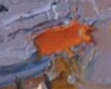
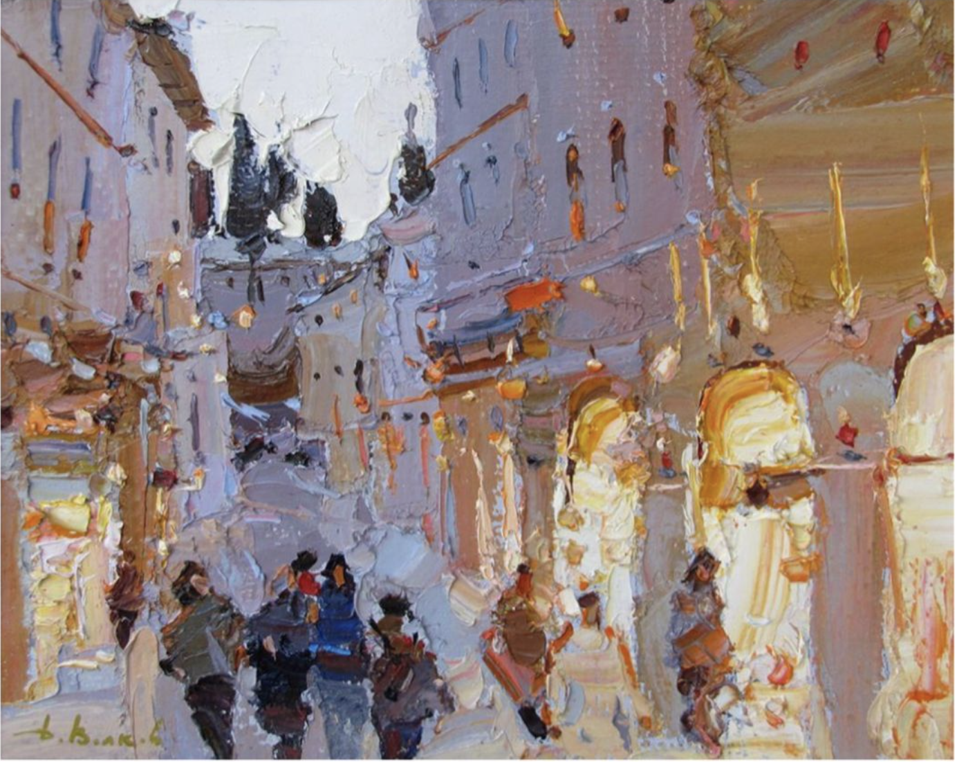
In the painting below notice the use of bright red. It pops and leads the eye around. Notice the largest red in the right of center. Got it?

Here’s a close up of the largest red pop.
Now here’s a black and white version of the red pop.
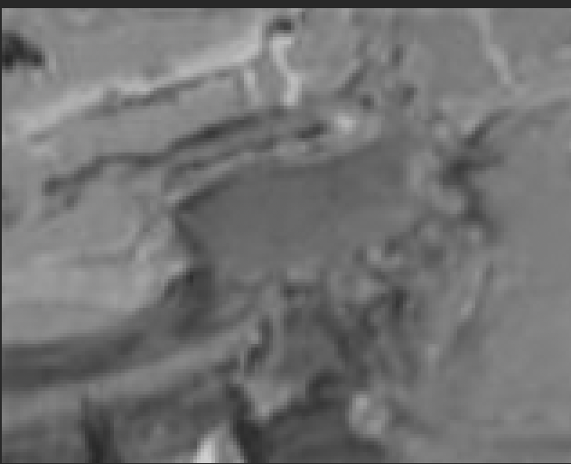
No pop! Where did it go? It’s like a magic trick and I’ll explain why it matters.
But first heres the whole painting, color and black and white, side by side. Notice where red disappears and where it doesn’t.
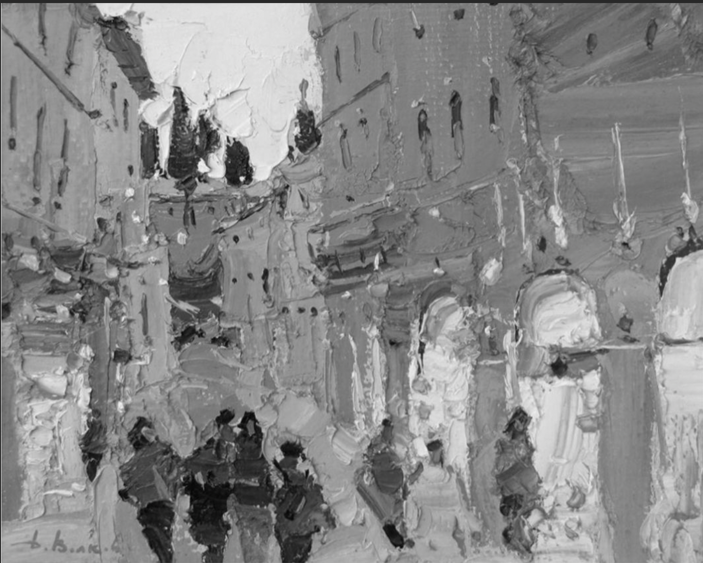
Notice that the red spots disappear in the black and white version. Why?
Volkov is playing with color. He uses a very bold warm red hue next to cooler less staurated tones. This creates a pop while still maintaining the same value ( darkness to lightness scale) as the area surrounding it. In artist talk, we refer to this as maintaining his value structure or not breaking up the big shapes. A stong yet simple value structure is what catches a viewers eye from across the room.